
For more information, contact:
- karenq at
karenq dot com
 Home page
 Member's page
 Editorial layout
 Publications page
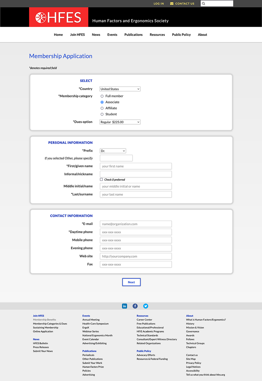 Online application
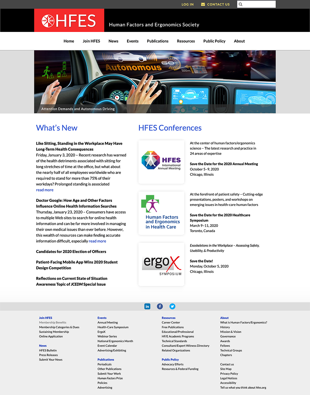
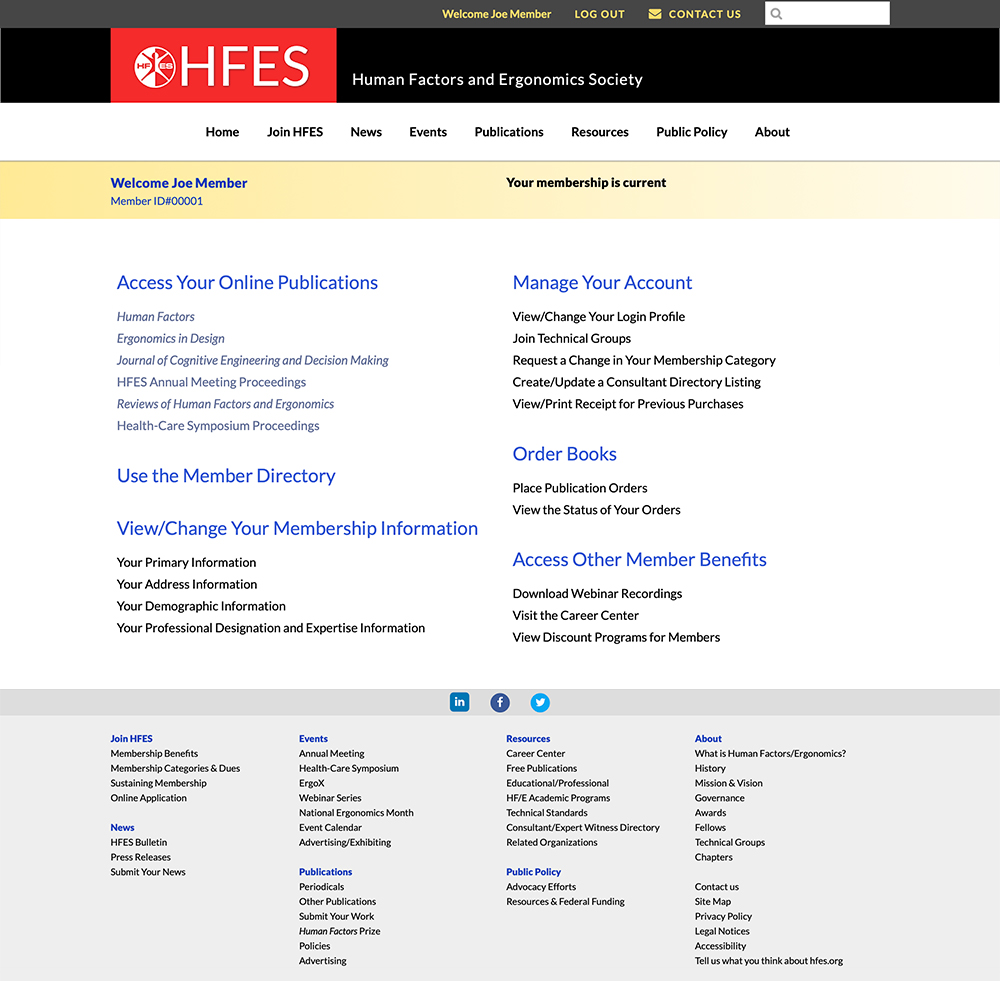
Client wanted to update and overhaul member organization website. The site is large, with "members‑only" areas, as well as public pages. Design objectives were to make the site responsive, inviting, and easier for members to navigate and know where they were.
See website mockup here
The redesigned website has dropdown navigation, and a slider and news feed on the home page.
When members log in to the redesigned website, they are taken to a personal membership page where they can update their profile, buy publications, search for other members, etc.
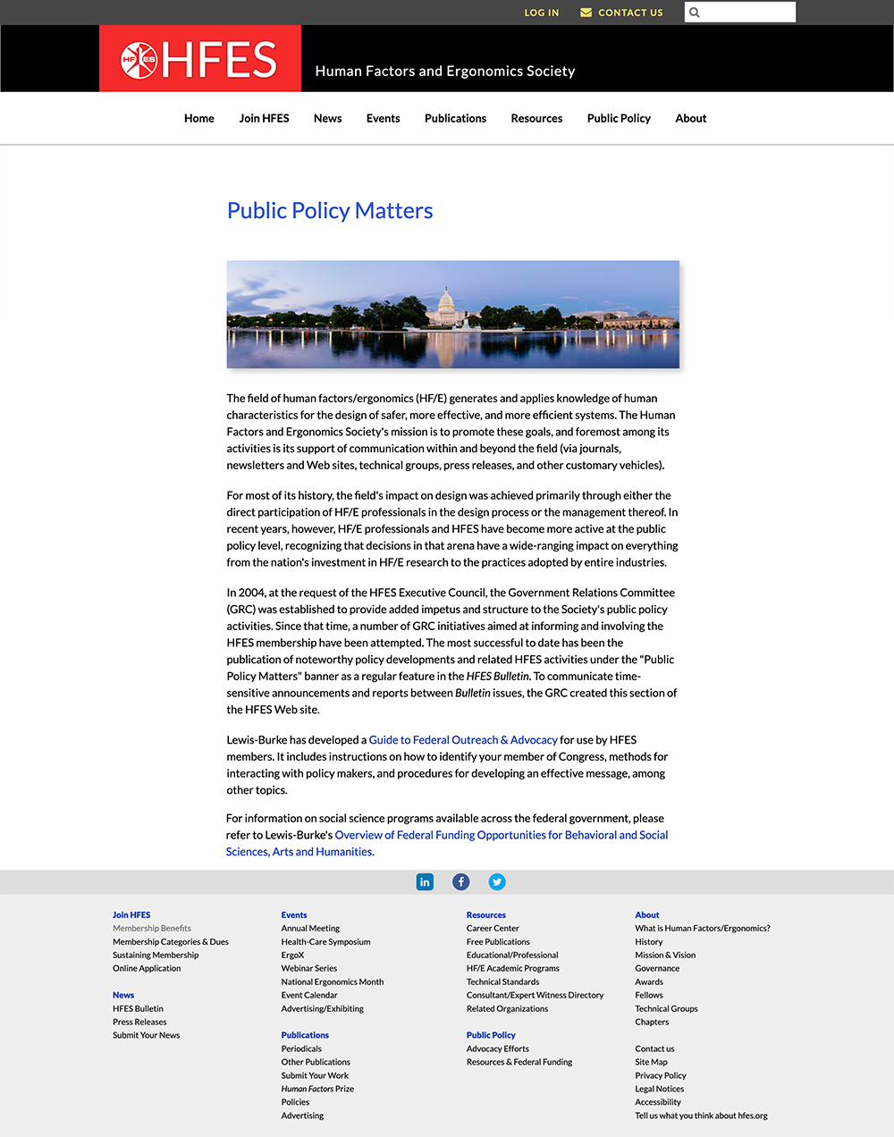
Design objectives were legibility, readability, a clean appearance.
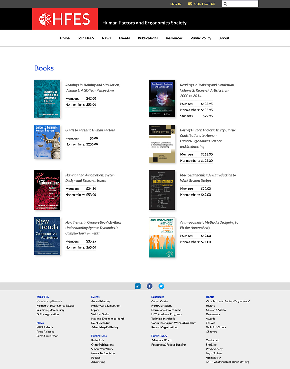
The design objectives were to improve the appearance of the pages, and to make clear to the viewer where they were in the purchasing process. The books page, shown here, would be the first page in the multi-page selection-through-purchase process.
Besides being responsive and adaptable to different devices, the objective was clarity, a clean look, and plenty of whitespace.